Flint IDE is primarily developed to aid developing screens for the Sparklet Embedded Graphics library. Various widgets available can easily be dragged and dropped from the toolbox on to the design view and properties edited to suit user requirements.
It is important to understand that Flint is also capable of generating RAPIDSEA project as well as a project containing both RAPIDSEA and Sparklet features. So, when a Flint Project is created, it might have resources for both of these.
Also, it is possible to have multiple Sparklet applications or windows in the same project.
The below diagram explains the hierarchy for a Flint Project with relation to Sparklet and RAPIDSEA features.
The output directory contains files built, if no default path is set. The contents of the resource directory can be shared across all the Sparklet Apps and RAPIDSEA. The Sparklet Apps folder contains different Sparklet applications organized as directories.
Each of these apps may have at least one Window and multiple views.
We will now discuss in detail the steps involved in creating the Flint project for a Sparklet application.
To set a context, here we will attempt to create an instrument cluster that has two screens.
Main screen – With some labels displaying Speedometer, Fuel gauge, Tripmeter, indicator Tachometer.
Settings Screen – With few widgets
This section explains the procedure to create a new project for Sparklet using the Flint IDE. To begin with, right click on the Flint Navigator (in Flint Perspective) or Project Explorer (in other perspective).
On the pop-up menu, select the New option. Another sub-menu will be displayed. Select the Project option from it.
On selecting the Project option, a dialog will be shown listing different kinds of projects supported by Eclipse. Under the Flint group, select Flint Project.
New Sparklet Application wizard will be started and will ask for the project name and its properties. Enter the project name. In this example, the Project name is Cluster_demo. Also select the Project Type as Sparklet.
Then, Select Silicon Vendor, Family, Part number, and Board. In this instance, we’ve opted for Renesas as the silicon vendor, chosen the RH850 family, specifically the RH850 D1M1A part number, and selected the Renesas AICv1 Cluster Platform as the board.
To create a new Sparklet application that is going to be executed as a separate task, right click on the “sparklet” folder. On the pop-up select the New item followed by Project in the sub-menu.
On completing the wizard, the Sparklet application is created. An efw (Embien Flint Window) file is created and is ready for editing.
The below screen shows the cluster_app.efw file opened in the design view.
Now, we can import images by simply copying and pasting it into resources->images folder as needed for our project.
Now the widgets can be dragged and dropped on to the window. For example, click on the Fixedview->FillColor in the widget toolbox and place it on the design view.
This will place a Fixedview – holder to contain child widgets at fixed positions on to the main window.
Double click on the dropped control and edit the properties and select any one of the colors from color palette under FillColor property.
Since we have to switch between two screens, we will need to create “View” to accomplish that. New view can be created apart from the window which can be placed programmatically on top of the window.
To create a new view, right click on the ‘screens’ folder and select New->Project. On the dialog, select ‘Sparklet View’ option.
Then the Wizard asks for View Name. In this case, we give a name - main_screen. This will create a main_Screen.efv file that has the same size as the project. Similarly create another view called settings_screen.
Note: It is advised to maintain the window (efw) or main background image of any screen as opaque (non-transparent image) for optimal functionality and to prevent unpredictable behavior.
It is Important to have data as they are the interface between the Sparklet view and RAPIDSEA or custom logic. By creating a data file, all the data that will be used by the application can be defined and same can be mapped to the widgets.
To create a new data file right click on data and select New->Project. On the dialog, select Sparklet Data File option.
There are two different tabs available in this view.
Data Variable –This is the actual data that is going to be consumed. It is similar to declaring a variable in C/C++
Data Bridge-It can be used to mention the way that the data can be consumed. For example, a float Data can be formatted in %0.2f format and consumed by a Label.
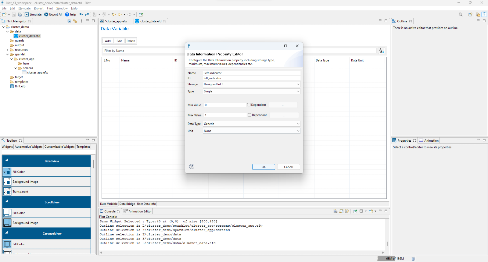
In the Data Variable Tab, click Add button. Provide Name, Id, Storage, Min Value, Max Value when prompted. In this case, let us feed in Left_Indicator, left_ind, Unsigned Int 8, 0 and 1.
Name: User identifiable string that can be separated by space.
ID: Unique name to identify the data. No spaces or special characters allowed.
Storage: Size of memory to be allocated for the data. Some of the data storage types supported are
Storage
Type
Description
Unsigned Int
8
Unsigned value occupying 8 bits within range 0 to
256
Signed Int 8
Signed value occupying 8 bits within range -128 to
127
Unsigned Int
16
Unsigned value occupying 16 bits within range 0 to
65535
Signed Int 16
Signed value occupying 16 bits within range -32,768
to 32,767
Unsigned Int
32
Unsigned value occupying 32 bits within range 0 to
4,294,967,295
Signed Int 32
Signed value occupying 32 bits within range
-2,147,483,648 to 2,147,483,647
Single
Precision
Value occupying 4 bits within range 3.4E +/- 38
Double
Precision
Value occupying 8 bits within range 1.7E +/- 308
String
Store sequence of characters
Minimum Value: Minimum value that can be accepted by this data. Attempt to store a value below this will be ignored. Also, it can be set dependent on another Data.
Maximum Value: Maximum value that can be accepted by this data. Attempt to store a value above this will be ignored. Also, it can be set dependent on another Data.
Data Type: Indicates the physical type of the data such as Generic, Pixels, Speed. Useful for conversions.
Units: Indicates the physical unit of the data such as None, Percent. Useful for conversions.
Next, select Data Bridge Tab, click Add button. Provide Name, Id, Conversion, Formula (Provide based on the data type) and Data 0 (Browse the required data information value).
In this case, let us provide (Trip Value, trip_value, Formatted String, %d, di.default_data.Trip_display). This indicates that the Trip value has to be formatted with a “%d” method and available as a string.
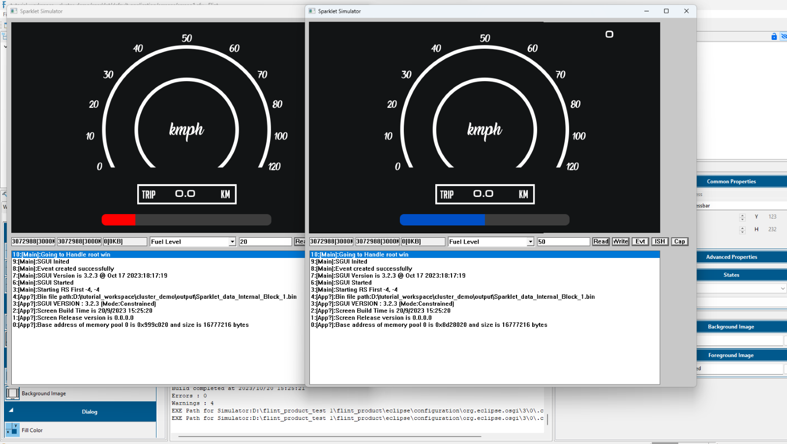
It can be used to map a range of values to one integer and use it for further operations like UI State etc. Let’s take the fuel gauge of an instrument cluster as an example. Here we have used a progress bar widget to show the fuel level in two different ranges.
Assume that the range of the fuel level is 0 to 100. The fuel bar will be in red up to the range of 20, and blue beyond that. Thus, we exported two different bar images and placed them in the images folder.
Create two Self UI states under state configuration and set the images for both states.
Select conversion as the Range Map in data bridge, then click Formula/Format. Enter the upper limit as 20 and 100 on the dialogue, and the return value, which is the UI state id, as 0 and 1, respectively.
Click Ok and set the respective Data variable in Data 0.
Now simply export and simulate. The fuel level will be displayed in red up to 20, above that the state id will be changed to 1 in which the blue bar will be displayed.
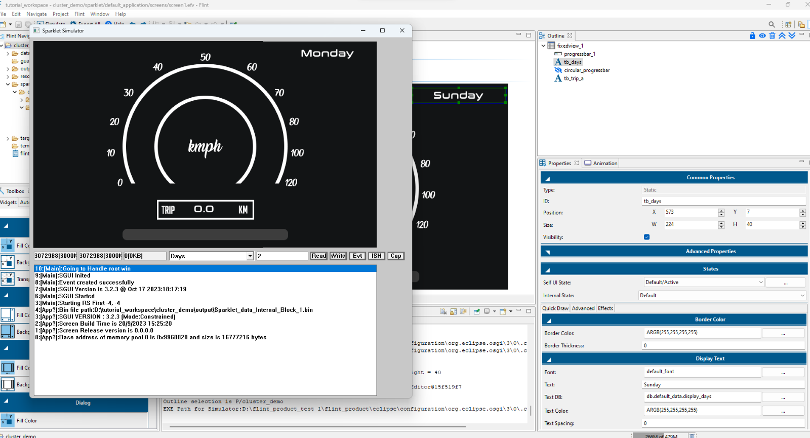
Now we will see Enumeration conversion. It can be used to map integer values to text information. Let’s take an example of the days of the week that are displayed on a label widget. Simply drag and drop a labels widget.
Now create data variable as ‘Days’ with minimum and maximum values,1 and 7 respectively.
Now select the data bridge and provide a name and ID, Choose the conversion as Enumeration. Click on the Formula/Format. In the dialog, enter the value and texts that are to be displayed on the label.
Click Ok and set the required data variable in Data 0.
Now map the data bridge to the label widget. Simply export and simulate it. By entering the corresponding data value, the days of the week will be displayed in simulation.
Days value and its corresponding label in simulation
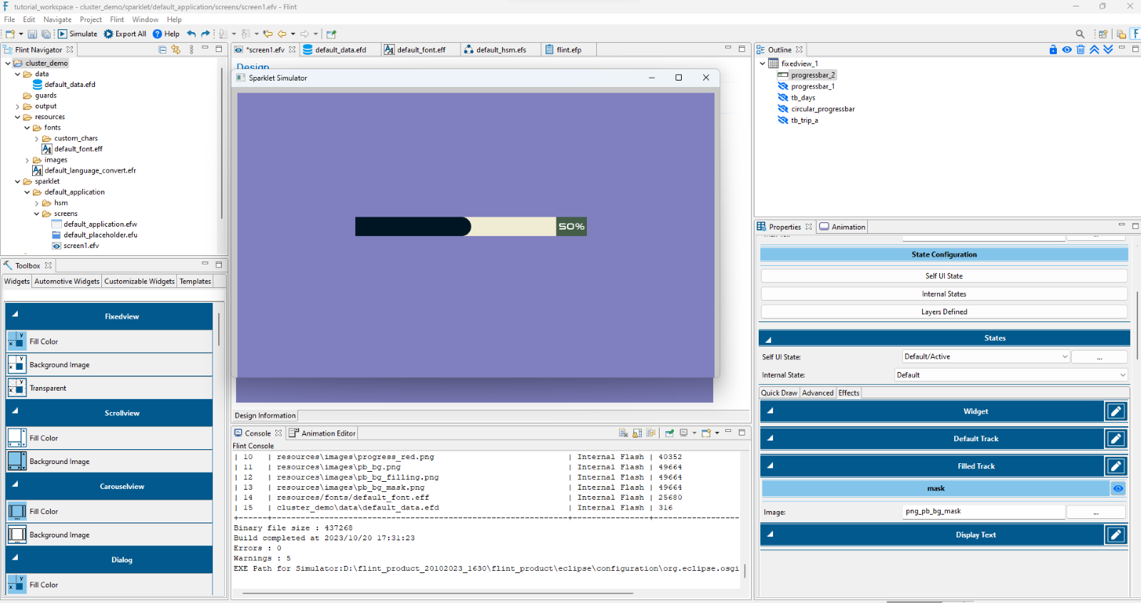
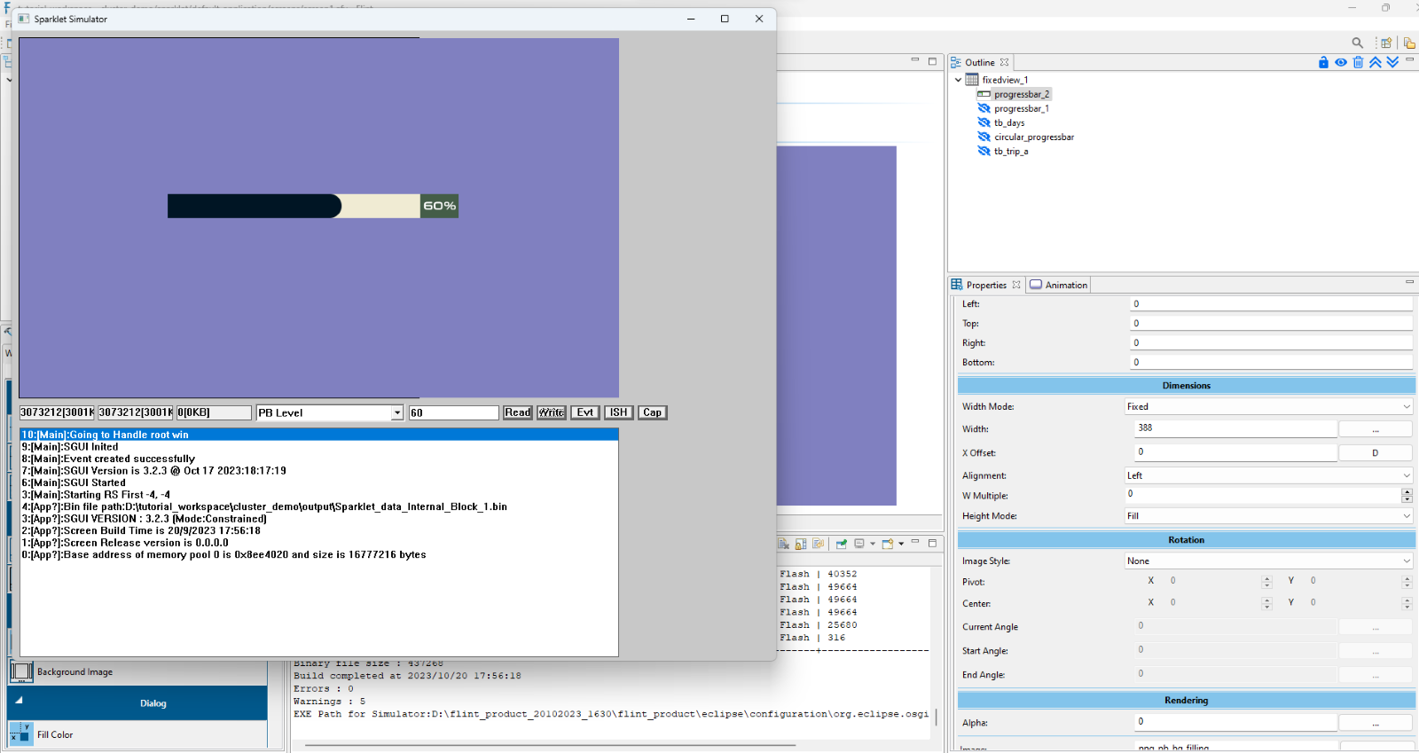
This method is used to convert values from one range to another. For instance, consider a customized horizontal progress bar widget with curved edges, where the total width of the bar is 388.
In the Data Bridge, choose “Scaling Absolute” as the conversion type. Then, click on “Formula/Format.” Set X1 to 0 and X2 to 100, representing the minimum and maximum values of the input data. For Y1 and Y2 & Min and Max, enter -388 and 0, respectively. These values define the X-position range, where -388 is based on the width of the progress bar in this example. You can adjust this value according to your design needs. Finally, assign the Data variable to Data 0.
Navigate to the Advanced properties and map the data variable to Cur Val. Next, go to the Advanced tab and map the data bridge to the X-Offset under the Dimensions section.
Note: The default Widget data should not be mapped to the Width of the filled track when the Data bridge (with scaling absolute) is mapped to the X-offset.
We can add our customized images which are going to be used in the application.
To achieve that, copy the images from the source location, expand resources folder, right click on images folder and select Paste/ Ctrl + V.
Flint provides a simple drag-and-drop mechanism for designing the views. Simply open view file (main_screen.efv in this case), drag and drop the Fixedview->Background Image.
Now double click on the dropped control and edit the properties, then select the required image from the list under BackgroundImage.
Next, add the necessary widgets. In this example, drag and drop Labels->Transparent and in Text DB field under Display Text and click the browse button to select the added data bridge value for this widget.
Other widgets from the widget toolbar carry out the following functions:
Widget
Description
Fixedview
View only container widget that can be used to place
child widgets at fixed positions with styles like
Transparent, filled color and customizable
background images.
List View
List view automatically manages the position of the
widget and orders them horizontally or vertically.
Carousel View
A carousel view widget is used to display multiple
views in a specific space.
Scroll View
The Scroll view widget is used to display the child
widgets that are large for the display area and can
be scrolled up/down or left/right.
Labels
View only control that can be used to present text
values/images with styles like Transparent, filled
color and customizable background images.
Button
User interactable control offering on/off states.
Transparent, filled color and customizable
background image buttons are supported by default.
Toggle Button
User interactable control offering on/off states.
Filled color and customizable background image
toggle buttons can be created.
Swipe Button
Using the swipe button widget, a slide effect can be
shown either horizontally or vertically.
Slider
User interactable control that can be used to change
values in a linear fashion. Can create vertical and
horizontal sliders with customizable background
images
Progress Bar
View only widget that can be used to present the
current value to the user in a linear manner. It is
possible to create vertical and horizontal progress
bar with filled color and customizable background
images
Rotary Knob
User interactable control that can be used to change
values in a circular fashion. Can create rotary
knobs with customizable background images. One has
to set minimum and maximum angles.
Image Holder
View only widget to show images.
Clock
This widget displays an analog clock with hands for
hours, minutes and seconds.
Dials
View only control that can be used to change values
in a circular fashion. Can create rotary knobs with
customizable background images. One has to set
minimum and maximum angles.
Dialog
A container widget with fixed dimensions and child
position, that can be shown at any desired position.
Further Flint follows a layered approach and hence it is possible to create multiple combinations of customizable widgets. The same is explained in detail in the following section.
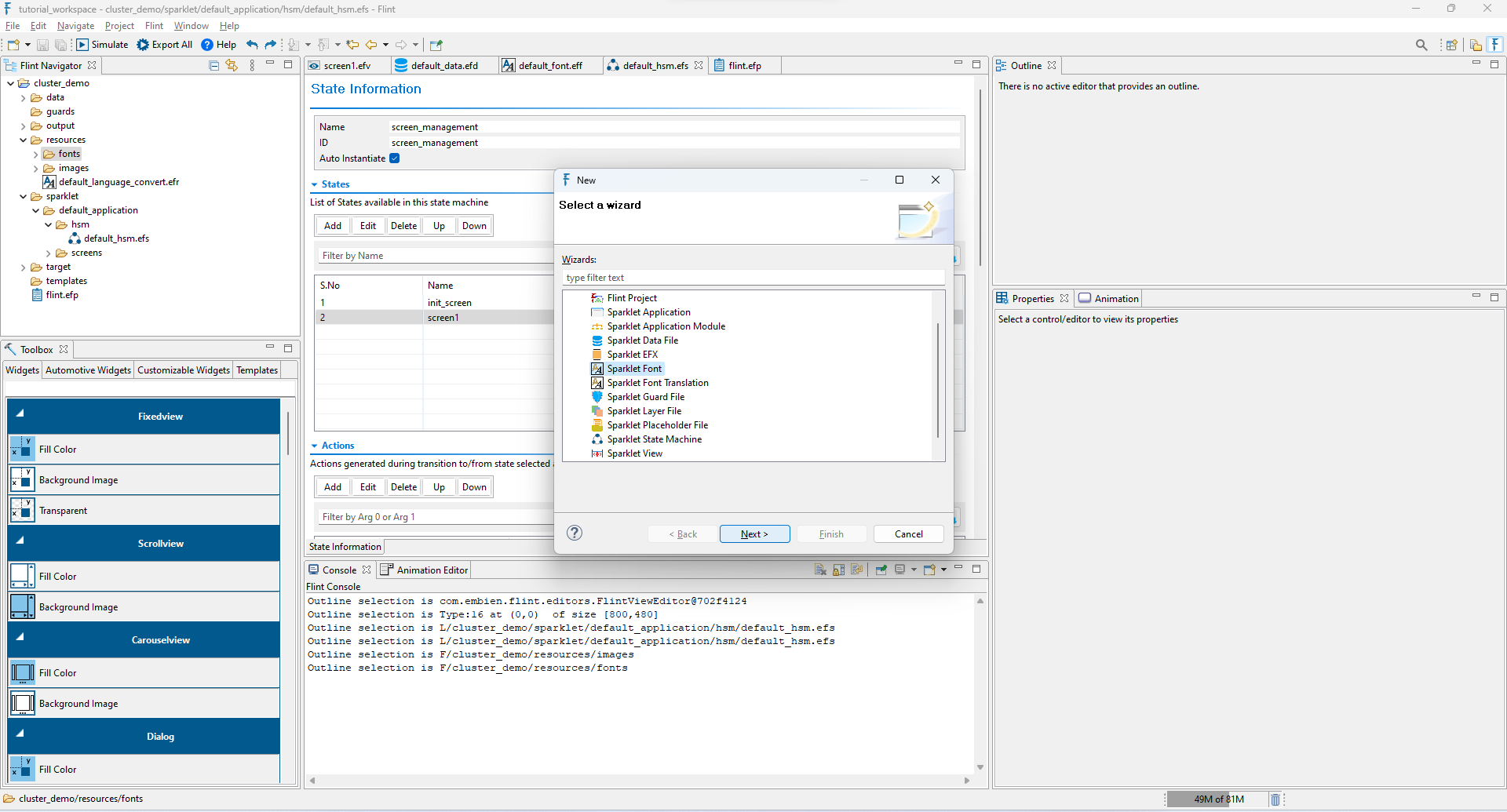
It is possible to create our own customized font for the text to be displayed. To achieve that, expand resources folder. Right click on fonts -> New ->Project. In the dialog select Sparklet Font option.
Now the multiple views have been created, we need to show them by placing them on the window. To achieve a dynamic flow, a Placeholder can be used. It is possible to place many views on the placeholder which is in turn placed on the window/another view.
Then with a HSM (Hierarchical state machine) approach it is possible to switch between the views in the placeholder creating a dynamic effect.
To create a placeholder, right click on the screens under (sparklet->Application directory (cluster_app,in this case) and select New->Project. On the dialog, select Sparklet Placeholder File option.
Click Add button. Provide Name, Id, Width and Height values (based on design needs) and in Parent field click the Browse button. Select the Application File Name (efw) under View File and select window under View Control.
Name: User identifiable string that can be separated by space.
ID: Unique name to identify the data. No spaces or special characters allowed.
X: X position of the Placeholder
Y: Y position of the Placeholder
Width: Width of the Placeholder
Height: Height of the Placeholder
Parent: Parent of the place holder. Could be a window or another view.
Since we have two views – main_screen and settings_screen, we can add them both in the place holder.
Click Add button under Views. Select the View file name under View file and under View Control which has been placed in that respected view.
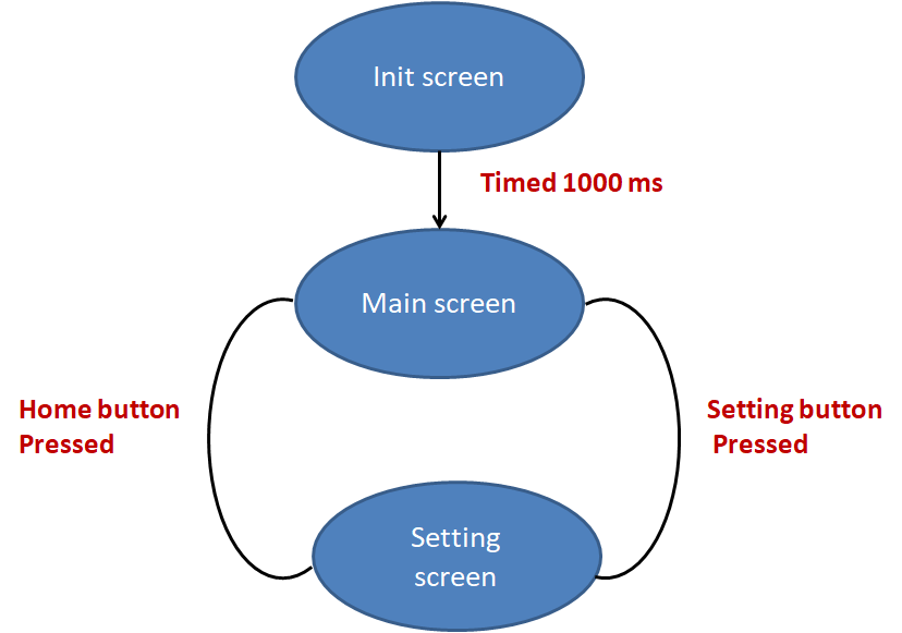
State Machines are one of the proven mechanisms that can be used to create large projects with clarity. Inspired by UML design methodology, Flint allows users to create Hierarchical State Machines (HSMs), define multiple states in the HSM, select events that can be received in a given state and actions to be taken for that particular event.
To create a state machine, right click on the hsm under (sparklet->Application directory (cluster_app,in this case) and select New->Project. On the dialog, select Sparklet State Machine option.
Provide Name, Id (Screen Management, screen_management) and check the Auto Instantiate.
Then click the Add button under States. Initially we want to give (init_screen for both Name and Id). Again, we can add Name and Id based on our number of view files (main_screen, setting_screen in this case).
Next, by selecting on the init_screen, click Add button under Actions and select ‘On Entry’ in When to generate, Place holder – Initialize in ‘Type’ & ‘Action’ and browse the Placeholder file (cluster_holder.main_app_holder) which has been created. Again, click Add button provide values On Entry in When to generate, Delayed Transition in Type of Action, provide time in Delay(ms).
Next click Add button under Events. Select Timers and Delays in Group, End of Delay in Type and screen name that switched over to the Next State.
Creating View Information in Sparklet State Machine
Next, by selecting on the particular view file(main_screen), click Add button under Actions and provide values On Entry in When to generate, Place holder – Show View in Type of Action and browse the Placeholder file (cluster_holder.main_app_holder) and browse the View Id which has been created.
Creating View Information in Sparklet State Machine
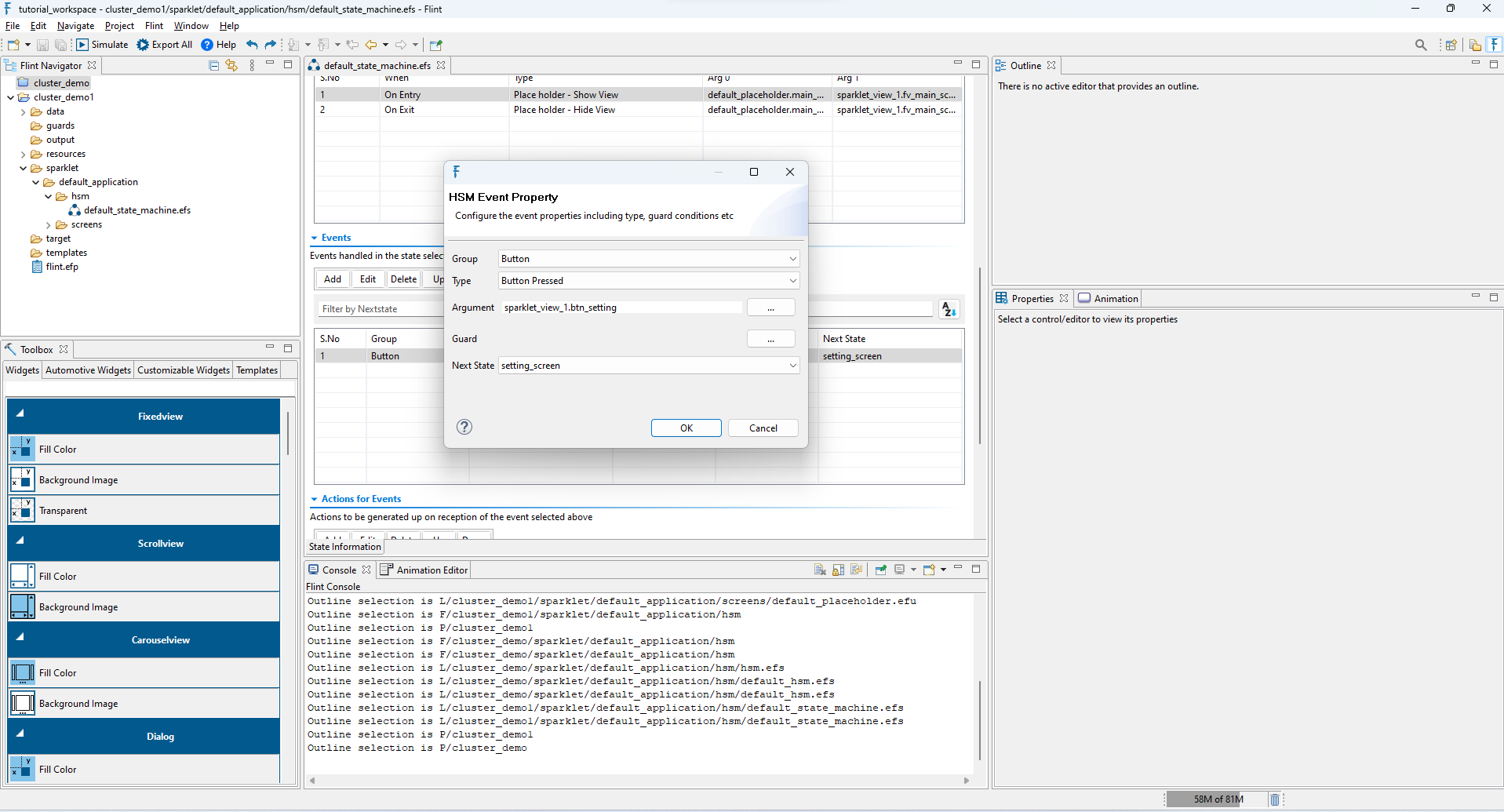
Click Add Button under Events, suppose if we have button in that view used to switch to the next screen, click Button in Group, Button Pressed in Type, click Browse Button in Argument (Select the View File Name and select the Button Name used for switching under Widget Control), select the screen name to which want to be switch over under Next State.
Proceed with the same value as above by clicking Add button again except (On Entry to On Exit) and (Place holder – Show View to Place holder – Hide View).
When to Generate: Used to set when the action is to be generated.
On Entry– Action generates when the screen is entered
On Exit– Action generates when the screen is exit
Type of Action:
Action Type
Description
At End
Delayed Transition
Used to set the delay in
milliseconds
State machine - Initialize
Place holder – Show View
Used to show the view in
placeholder
Place holder – Hide View
Used to hide the view in
placeholder
Place holder – Go to next View
Used to go for the next view in
placeholder
Place holder – Go to previous
View
Used to go for the previous view
in placeholder
UI State – Set
Used to set State value for the
widget
Data – Set
Used to set particular value for
the widget
Data - Increment
Used to increase the value
Data - Decrement
Used to decrease the value
Widget - Show
Used to show the widget
Widget - Hide
Used to hide the widget
Widget - Enable
Used to enable the widget
Widget - Disable
Used to disable the widget
HSM Event Property
Group
Type
Description
Internal
Initialization
Timers and Delays
End of Delay
Key Input
Key Down
Event triggered when
the specified key is
pressed
Button
Button Pressed
Event triggered when
the specified button
is pressed