There is a separate perspective available optimized for the Flint development.
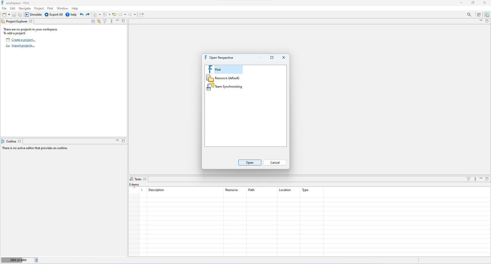
This can be chosen by selecting the Open perspective icon, which is placed in the upper right corner of the window, or we can choose from the list accessible from Window ->Perspective->Open Perspective ->Other.
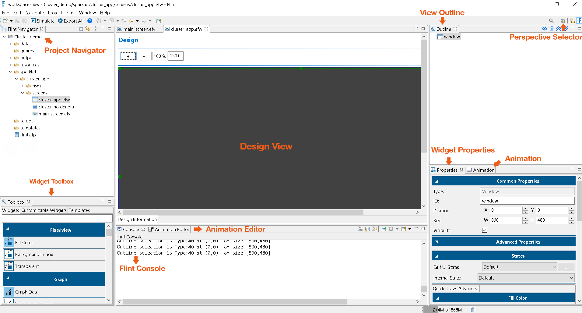
The left part of the view houses the Project Navigator. Here all the Flint projects created by the user will be visible. A project can be opened or closed.
New projects can be created, and unnecessary ones can be deleted. Other standard Flint project actions are also supported.
This is the central part of the UI where the Sparklet/RAPIDSEA view can be designed. Users can design their screen in this view. Flint offers various features that ease the UI design. Some of them include
Drag and Drop: New widgets can be dragged from the Widget toolbox and placed here. All the properties of the created widget can be edited using the Widget Property area.
Change of Parent: It is possible to move a widget from one parent to another inside a view just by dragging the child and dropping it to the new parent.
Deleting Widgets: A widget can be removed from the view by double clicking it and pressing the Delete button. Flint asks for user confirmation before removing the widget.
Undo & Redo: The Undo and Redo features allow the users to remove or repeat the most recent changes made in design. Currently, Undo & redo can be supported only for widget addition, deletion, widget-ID change, size (W x H) and position (X x Y) and change of parent.
Note: Design view supports only one widget as direct child. To have more than one child, place a container widget like a Fixed view or list view and add multiple children to them.
In the left side of the view, there is a toolbox that displays all the supported widgets. From here, users can select the widget and place them in the design view.
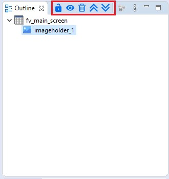
In addition to the Widget Toolbox, there is another view located on the right-hand side known as the Outline view. This view presents a hierarchical representation of the widgets within the current view, organized in a tree structure.
Within the outline view, users can find several icons within the outline toolbar, as illustrated below:
Up Arrow: This icon facilitates moving a widget higher up within the widget hierarchy.
Down Arrow: Conversely, this icon enables the movement of a widget further down within the widget hierarchy.
Delete Icon: Users can employ this icon to remove widgets from the layout.
Show/Hide Icon: The visibility of widgets can be toggled using this icon.
Lock/Unlock Icon: This icon permits users to lock widgets i.e.,the position, size, or other properties of the widget are fixed, preventing accidental or unwanted changes.
Below the Widget Toolbox area, at the bottom right, there is a list available showing the properties of a currently selected widget. If the user double clicks on a Widget in the design view or Outline view, the properties of that widget are loaded to this view.
Users can edit each of these properties individually.
In the status bar of the Eclipse IDE, the help corresponding to each widget property is displayed. When the user double clicks a widget, its properties are loaded in the Properties view.
Then if any of the property is being clicked, then the help text corresponding to the property is loaded in the help area.
Flint provides a separate console that is used to display the status of build operations. Any errors, issues, warning as well as success status are displayed in this view.
Eclipse perspective selector, usually available at the top, can be used to switch between perspectives. For example, users might go for a Java Perspective when editing a Java code and immediately switch back to Flint perspective when editing the screens.
With an understanding of the Flint perspective, we are now ready to proceed to develop Flint and RAPIDSEA projects.
In Flint, animations can be seamlessly integrated into various aspects, including Entry/Exit, Internal State, UI State, Views, and Change of Child. Users have the flexibility to add, modify, and remove animations within the dedicated Animation section.
Entry/Exit - Apply animations during the entry and exit of a widget or view.
Internal state - Apply animations for transitions within the internal state of a widget.
UI State - Apply animations for transition within the Self UI state of the widget.
Views - Apply animations for transitions between different views. Always add ‘Views’ animation to the parent container widget of a view.
Change of Child - Animation to change the child widget using swipe actions.