Here are the steps to utilize the progress bar widget:
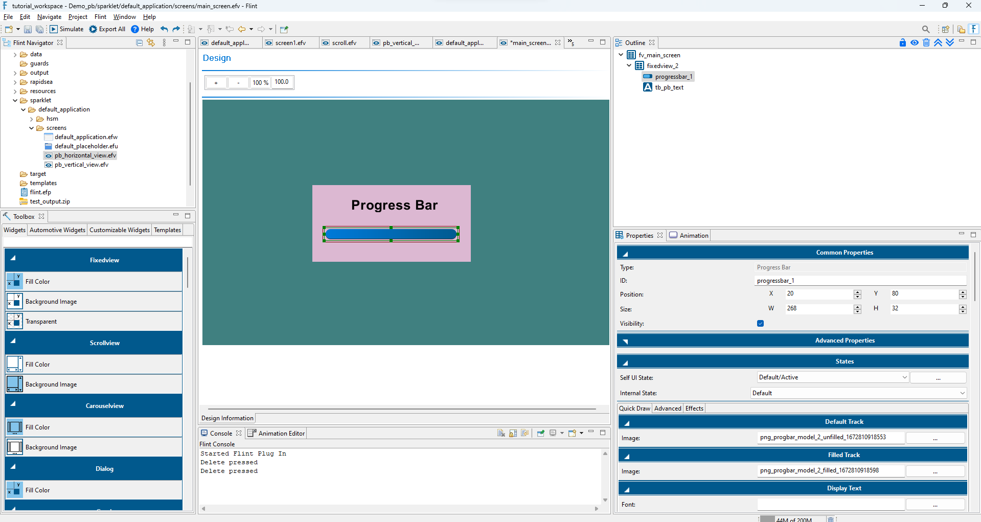
Drag and drop the progress bar widget onto the design view, selecting the horizontal type and adjust the widget’s size as needed. The progress bar widget comes with two default layers: Default Track and Filled Track. Add images to these layers - use the Progress Bar background image for the Default Track and the fill bar image for the Filled Track.
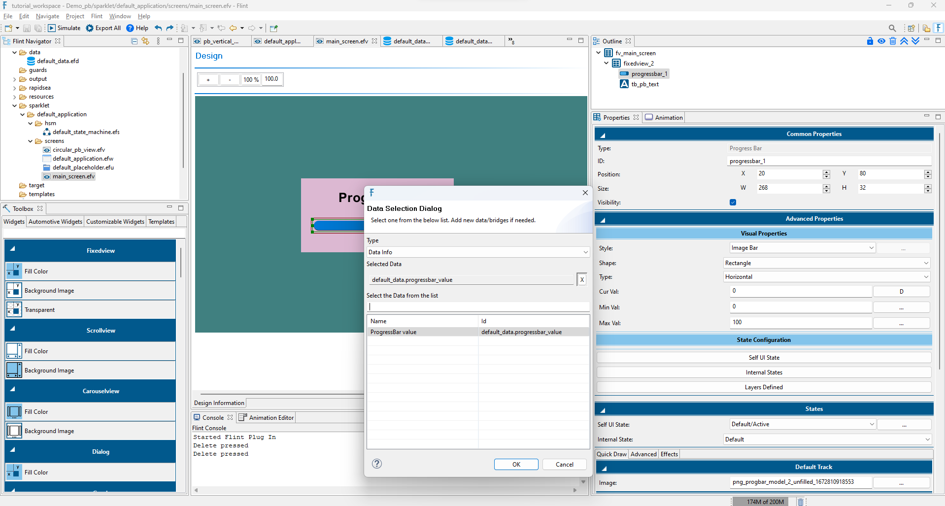
Move to the Advanced tab within the Properties section. In the filled track layer, under Dimensions, set the Width mode to Fixed and enter the width of the Progress Bar widget, and map the Widget Data to the Width option.(For vertical types, adjust the Height mode accordingly.)
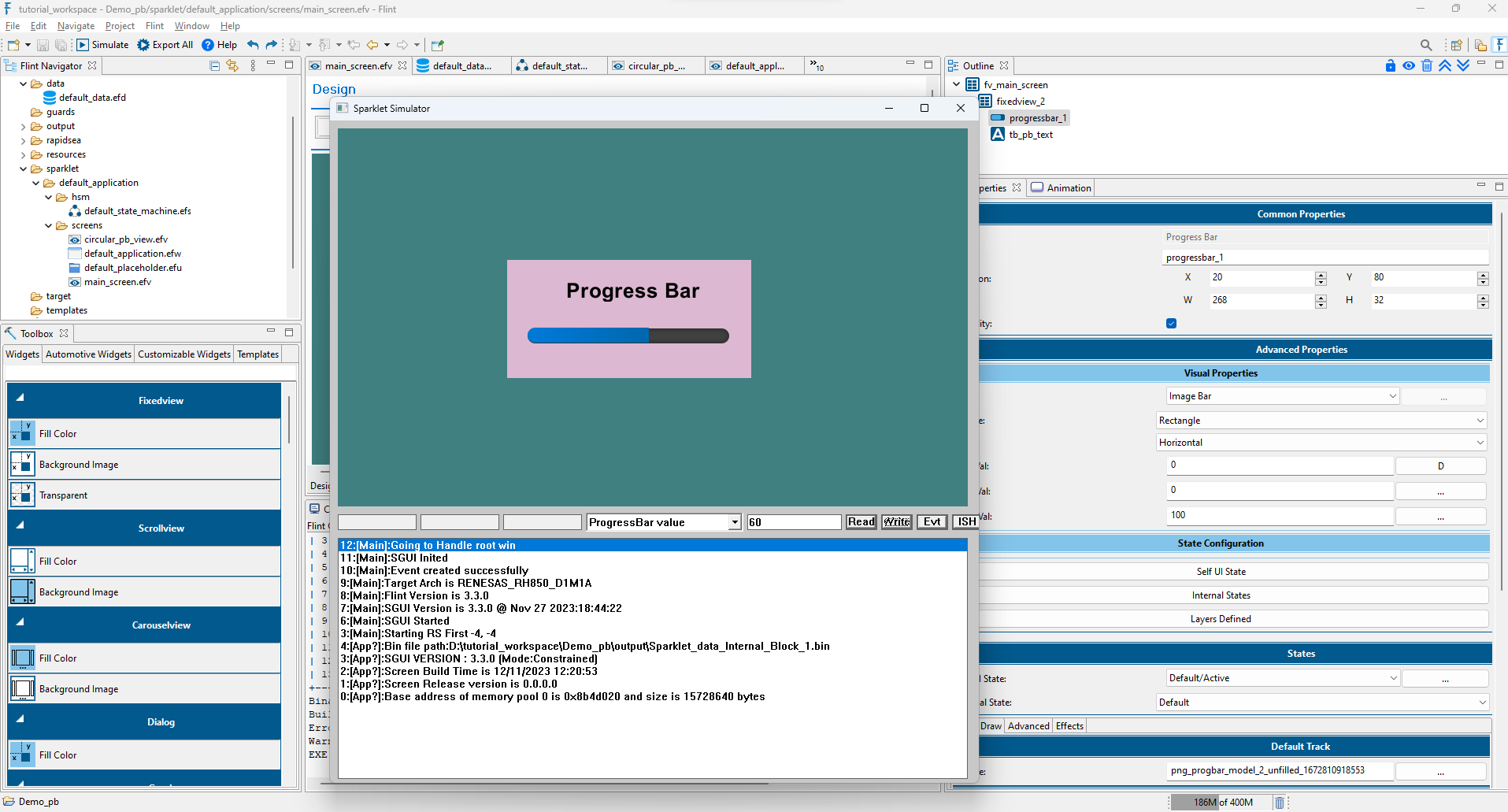
Export and simulate the project. The progress bar fill will dynamically respond based on the data value, providing a visual representation of progress.