Common Properties: Some of the properties common to all widgets are available here
Type - Widget Type (Static, Button etc)
ID – Unique user defined ID
Position – X and Y position of the widget
Size - Width and height of the widget
Advanced Properties: Contains settings about widget specific features that may or may not be available for different widgets
Shape – Shape of the widget- Currently only Rectangle is supported.
Style – Quick change of layers used.
Current Value – To set the current value to be displayed.
Minimum Value - To set the minimum value that can be displayed.
Maximum Value - To set the maximum value that can be displayed.
Start Angle – Starting angle for rotation-based widgets
End Angle – Ending angle for rotation-based widgets
Direction – Clockwise/Anti-Clockwise setup for rotation-based widgets
Type – Horizontal/Vertical for orientation setup.
State Configuration: To set up the State of the widget
Self UI State – To define the theme-based state of the widget.
Internal State – To define the supported state of the widget. For example, Pressed/Released/Disabled states for a button
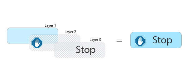
Layers Defined – To define the layers that constitute the widget during rendering. Widget Layers can be added and deleted from the Layers defined option. To add a new layer to any widget, it is necessary to set the style of the widget to ‘Custom’.
States: To set up the current Self UI state and Internal state and configure the layers.
FillColor layer: To fill the layer with single solid color.
Property
Description
Margins
Left
To set left margin
Top
To set top margin
Right
To set right margin
Bottom
To set bottom margin
Dimensions
Width Mode – Fill
Filled width mode. This layer
tries to fill the complete width
of the widget
Width Mode – Fixed
Fixed width mode. This layer tries
to fill only the actual size and
repeats
Height Mode – Fill
Filled height mode. This layer
tries to fill the complete height
of the widget
Height Mode – Fixed
Fixed height mode. This layer
tries to fill only the actual size
and repeats
Rotation
Pivot
Not used
Center
Not used
Current Angle
Not used
Start Angle
Not used
End Angle
Not used
Fill Color Specific
Fill Color
Used to set the color for the
layer
Image layer: To draw an image in the layer
Property
Description
Margins
Left
To set left margin
Top
To set top margin
Right
To set right margin
Bottom
To set bottom margin
Dimensions
Width Mode – Fill
Filled width mode. This layer
tries to fill the complete width
of the widget
Width Mode – Fixed
Fixed width mode. This layer tries
to fill only the actual size and
repeats
Width Mode – Wrap
Wrapped width mode. This layer
tries to fill only the actual size
and do not repeat
Height Mode – Fill
Filled height mode. This layer
tries to fill the complete height
of the widget
Height Mode – Fixed
Fixed height mode. This layer
tries to fill only the actual size
and repeats
Height Mode – Wrap
Wrapped height mode. This layer
tries to fill only the actual size
and do not repeat
Rotation
Image Style
– Rotated Image
Image is rotated based on the
current angle. It’s compatible with
EFX Animation images as well as
custom storage. For optimal results
with EFX-Custom Storage and image
rotation, it’s recommended to
maintain transparent borders around
the images.
Image Style – Radial Clipping
(Clockwise)
Radially clip the image between
start angle and current angle in a
clockwise direction
Image Style – Radial Clipping
(Anti-Clockwise)
Radially clip the image between
start angle and current angle in
an anti-clockwise direction
Image Style – Animation Control
To control EFX-Animation image
sequence
Pivot
Point at which the image’s Center
(specified below) will be placed
and rotated
Center
Center point of the image around
which it should be rotated
Current Angle
Used to set Current Angle for the
rotation/clipping
Start Angle
Used to set Start Angle for the
rotation/clipping
End Angle
Used to set End Angle for the
rotation
Image Specific
Image
Used to set the image to be
rotated/clipped
Border Color layer: To fill the layer with bordered color
Property
Description
Margins
Left
To set left margin
Top
To set top margin
Right
To set right margin
Bottom
To set bottom margin
Dimensions
Width Mode – Fill
Filled width mode. This layer
tries to fill the complete width
of the widget
Height Mode – Fill
Filled height mode. This layer
tries to fill the complete height
of the widget
Rotation
Pivot
Not used
Center
Not used
Current Angle
Not used
Start Angle
Not used
End Angle
Not used
Border Specific
Border Color
Used to set the color for the
border
Border Thickness
Used to set the thickness for the
border
Display Text layer: To draw text information
Property
Description
Margins
Left
To set left margin
Top
To set top margin
Right
To set right margin
Bottom
To set bottom margin
Dimensions
Width Mode – Fill
Filled width mode. This layer
tries to fill the complete width
of the widget
Height Mode – Fill
Filled height mode. This layer
tries to fill the complete height
of the widget
Rotation
Image Style – Rotated Image
Not used
Image Style – Radial Clipping
(Clockwise)
Not used
Image Style – Radial Clipping
(Anti-Clockwise)
Not used
Pivot
Not used
Center
Not used
Current Angle
Not used
Start Angle
Not used
End Angle
Not used
Text Specific
Text Horizontal - Left
Used to set the text in horizontal
left alignment
Text Horizontal -Center
Used to set the text in horizontal
center alignment
Text Horizontal -Right
Used to set the text in horizontal
right alignment
Text Vertical –Top
Used to set the text in vertical
top alignment
Text Vertical -Middle
Used to set the text in vertical
middle alignment
Text Vertical -Bottom
Used to set the text in vertical
bottom alignment
Font
Used to set the customized font
for the text
Text
Used to set the value for the Text
Text DB
Used to map the data bridge value
for the text
Text Spacing
Used to set the minimum width
between the characters.
In Flint, alignment usually refers to how the content or text within a specific widget is aligned. The alignment properties control the positioning of the content within the widget.
Common alignment settings in Flint include:
Horizontal Alignment: User can set how the content is aligned horizontally within the widget. Options typically include
Left: To align the content to the left edge of its widget.
Center: To center-align the content horizontally within its widget.
Right: To align the content to the right edge of its widget.
Vertical Alignment: User can specify the vertical alignment of the content.
Top: To align the content to the top edge of its widget.
Middle: To middle-align the content vertically within its widget.
Bottom: To align the content to the bottom edge of its widget.
These alignment properties are often used to control how text or images are displayed within widgets to ensure a well-organized and visually pleasing interface.
In Flint, user can use combinations of horizontal and vertical alignment settings to precisely control the placement of content within widgets, such as Left-Top, Left- Middle, Left - Bottom, Center-Top, Center-Middle, Center-Bottom, Right-Top, Right-Middle, and Right-Bottom. These combinations allow for fine-grained control over the alignment of elements in the user interface.
Here are some examples of these combinations in Flint
Margins in Flint refer to the space around the edges of a widget. They control the spacing between the content of the widget and the widget’s outer edges.
Margin Adjustments for Text Widgets:
Margin adjustments for text in Flint involve modifying the space between the text and the edges of the text widget. Users can control the following margin settings for text:
Left Margin: Adjusts the space between the left side of the text and the left edge of the text widget.