Standard Widgets Library
Flint comes with a large collection of pre-made widgets that are easily customized using simple property settings. With simple drag-and-drop you can create user interface without having design expertise.
Flint comes with a large collection of pre-made widgets that are easily customized using simple property settings. With simple drag-and-drop you can create user interface without having design expertise.
Embien has enhanced the Flint UI Designer by incorporating a wide range of widgets, recognizing that the tool's effectiveness is directly tied to the variety of widgets it supports. Significantly, Flint includes a widget tool box that is customized based on the application domain. For instance, our automotive toolbox includes Left/Right turn indicators, various dial gauges, and fuel/temperature bar graphs, and so on. Engaging user interaction widgets, such as Carousels, swipe buttons, and Pop-ups, are also part of our offerings. Container widgets like Fixed Views, Scroll Views, and List Views offer diverse arrangements for placing child widgets.
Flint provides users with the ability to craft their own custom widgets, with which new designs and interactions can be defined.
The Fixed View Widget in Flint serves as a container for multiple child widgets, efficiently managing them based on parameters such as width, height, and position. It allows the placement of one or more widgets on the screen according to specific requirements. This widget offers three distinct styles:

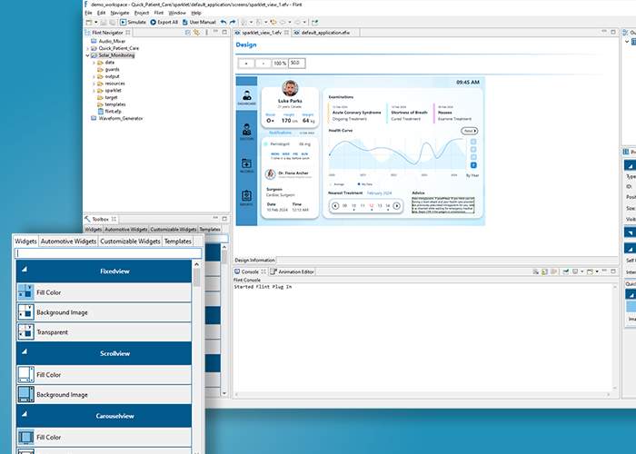
A carousel view widget is used to present a collection of views in a scrolling manner, either horizontally or vertically. The users can navigate through a set of views by swiping or clicking, similar to a carousel of images or content.
The ScrollView widget is used to create scrollable views. ListView is the most commonly used scrolling widget. ScrollView accepts only one child. It contains three internal widgets: two Scrollbars and a viewport.
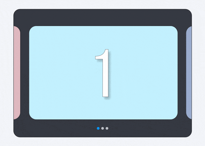
The ListView in Flint shows its child widgets consecutively, either in a horizontal or vertical arrangement based on the selected type. Flint provides a ListView widget with three distinct styles - Fill color, Transparent, and Background image - available in both horizontal and vertical type.

A dialog widget is used to display information, prompt user input, or present messages to the user in the form of a pop-up window. It typically interrupts the current workflow or interaction on the screen and requires the user to take some action or provide a response before continuing.Types of dialogs in Flint

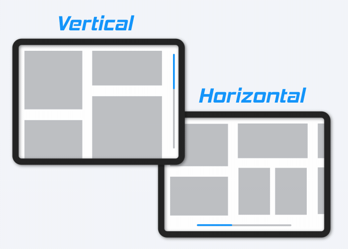
The progress bar widget is used to show the progress of a task. For instance, it is preferable to let the user see the download or upload progress when uploading or downloading something from the internet. Flint supports both horizontal and vertical progress bars widgets.
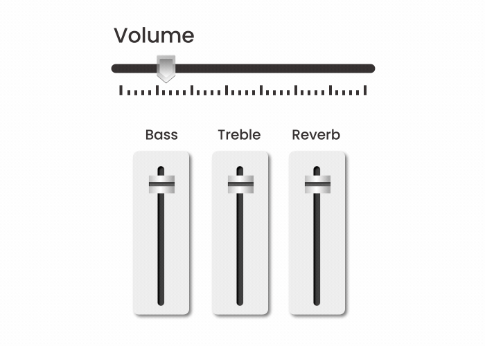
A slider widget allows users to select a value from a continuous range by dragging a handle along a track. It is often used to adjust settings or input numeric values within a specific range. The slider typically consists of a visual track and a draggable handle (Knob) that can be moved horizontally or vertically.
A circular progress bar widget visually represents the progress of a task in a circular or radial format. Instead of a linear bar, as seen in traditional progress bars, the circular progress bar consists of a circular shape that fills up to indicate the completion of a task.

The Dial widget is a circular value input control used to indicate the current value of a metric on a specified range using a pointer or needle. For eg: a Speedometer, which comes with an indicator or pointer to mark the position of the key metric value in a given range.

A rotary knob widget allows users to interactively adjust a value by rotating a circular control. Users can adjust a parameter by turning the knob in a clockwise or counterclockwise direction.

A push button widget allows users to interact with an application by clicking or pressing it. It is a user interface component designed to respond to user input and trigger a specific action or function when activated.

A radio button widget allows users to make a single selection from a list of mutually exclusive options. When a user selects one radio button in a group, it automatically deselects any other radio buttons within the same group, ensuring that only one option can be chosen at a time.

A toggle button widget allows users to switch between two states, typically representing an on/off or active/inactive condition. It serves as a control that can be toggled between these states with a single click or tap.

Labels widget is an input element which holds the alphanumeric data. It enables the user to enter text information. Flint supports Text Overflow feature that includes the Clip and Marquee.

An imageholder widget is used to show visual content, typically in the form of images. The primary purpose of an imageholder widget is to present static or dynamic visual information to the user.

Flint offers an analog clock widget that is entirely customizable, featuring graphical elements like clock hands for hours, minutes, and seconds.
